
When I first took up photography full-time in 2014, I became completely joined at the hip to Adobe’s photography-related products: Lightroom and Photoshop. For many years before then, we had just been casual acquaintances. Over the years, we’ve settled into a very comfortable and predictable relationship. We’ve grown older together, seen changes around us and tried to adapt as best we could.
But sometimes you grow apart as a result. When Adobe first moved completely into a subscription model and last year announced its intention to move more into cloud and web-based image editing, I knew that we were on the skids and destined, someday, for a breakup.
Well, that day has come, sort of. As of today, I’ve moved out of Lightroom, trading in its familiar interface for the new face of ON1 Photo Raw. Continue reading “Breakin’ Up is Hard to Do”
 Experienced photographers who share their knowledge with new photographers spend a lot of time talking about composition and the “rules”. Leading lines, rule of thirds, negative space, etc. help to teach the eye what to look for when evaluating a scene. But they don’t spend a lot of time talking about why these rules matter at all.

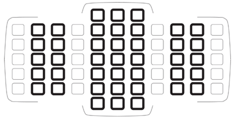 As with most things photographic, there is theory and there is practice and sometimes the two don’t mesh exactly. Here’s what I’ve learned about autofocus.
 The start of a new year. Time to consider shaping up – not only personally but maybe for your photography workflow. How can you do things better? At the very least, you’ve probably accumulated a huge amout of content this year. Are you running out of storage space? And are you safeguarding your work appropriately?
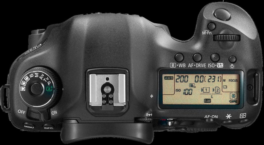 And then what do we do? We turn everything off and shoot completely manually, because “that’s what pros do”. Think about that for a minute. Does that make sense to you? Give your head a shake.
 A watermark is an identifier that sits overtop of some portion of the image. It is usually semi-transparent. The identifier could be the photographer’s name, their business name, or a combination of both. A copyright symbol and year might also be included. These labels might be simple white text or more elaborate logos and fonts. They are most often placed in a corner of the image, but sometimes can occupy more central space. Text sizes vary, but most are unobtrusive, aiming not to interfere with proper viewing of the image.

